How We Help You Sell
Select Transactions (Sellers)
Keep Your Cash Sell Your Home
A Move-In Ready Home Sells For More
Maximize Your Sale Price with Superior Marketing
Our Process Reduces Risk
Save Your Time and Feel In Control With Concierge Service
All Articles
How To Compete Against Cash Buyers in Silicon Valley
Will Palo Alto Home Prices Crash?
Buyer Case Study: Finding Off-Markets for Anita
Building 60 Shearer
Luxury Outlook 2025
Case Study: the Transformation of 1220 Pitman
How To Prep A House For 419% ROI
13 Pictures That Explain the North Palo Alto Real Estate Market
The Mirage of Palo Alto's Falling Home Prices
How Much is My Crescent Park Home Worth?
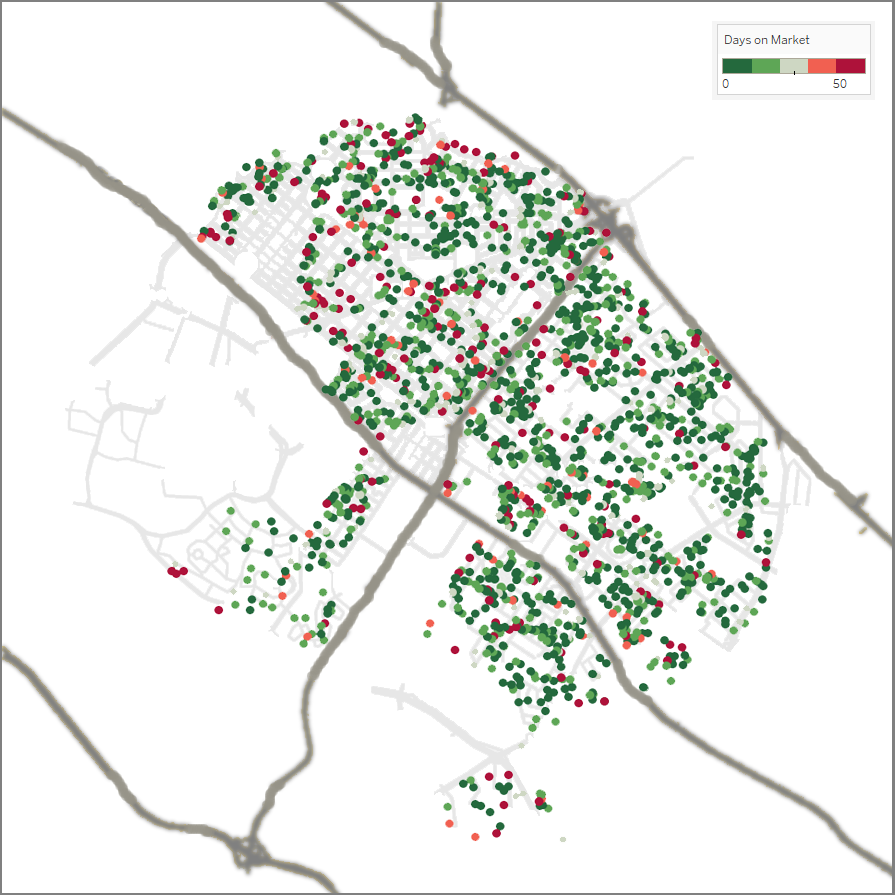
Silicon Valley Interactive Map
10 Intriguing Maps of Palo Alto
Exodus from Silicon Valley? Not in Housing!
How Recession-Proof Are Palo Alto and Atherton Home Prices?
Atlas of Luxury 2020
What Are the Best Investment Neighborhoods in Silicon Valley?
Current Market Report
Luxury Outlook 2025 Mid-Year Report