
What are the Best Investment Neighborhoods in Silicon Valley?
March 9, 2020
At the Young Platinum Group, our clients tend to be pretty numerate, and ask us frequently about the investment value of different neighborhoods up and down the Peninsula. And when we are not buying, building, or selling, we enjoy frolicking in the data like kittens in a yarn factory. What follows is our exploration of the data, but to know what is right for *you*, we need to learn your goals, wants, and needs to find the best fit for your new home. Call us today to customize this research to your needs!
Exec Summary
For pure appreciation, nothing has beat the 101 Corridor over the past seven years. And the best mix of quality of life and appreciation comes from Blue Blood neighborhoods near a downtown.

The strongest pure investment opportunities (+170% appreciation) were in the “101 Corridor” between Menlo Park to San Carlos. Opportunities here are modestly priced, with an average price of $1.4 million.
Of our ten most expensive neighborhoods, those that were easily walkable to a downtown appreciated +109%, at an average sales price of $4.8 million. These areas offed the best blend of strong appreciation and high quality.
Downtown cores were strong performers also (+95% appreciation, $2.73 million average sales price). People increasingly like to walk to restaurants and live in vibrant, denser neighborhoods.
Defining Our Question
The question we want to answer is, “What are the best investment neighborhoods in Silicon Valley?” The way we are going to tackle this is to assume that past performance is predictive of future results… which anyone will tell you is an iffy proposition, but looking at past results is perhaps the best “big-data” way to predict the future. The core driver of house prices in this area is the roughly 3:1 imbalance between jobs created and houses built, and that seems likely to continue. Let’s break the question down a bit further.
WHERE Are We Looking At?
Let’s first define neighborhoods. We’re going to use the MLS (Multiple Listing Service) public data. They have a nifty field called “Area”. This is smaller than a city, but bigger than an elementary school district. We renamed some to more commonly used terms (i.e.- from “Atherton: El Camino to Alameda” to “West Atherton”). We’re only going to look at cities that the Young Platinum Group is active in, which are Palo Alto, Atherton, Los Altos, San Carlos, Redwood City, Menlo Park, Woodside, and Portola Valley. Because there are fewer sales in each Portola Valley and Woodside neighborhood, these are aggregated up to the Town level. After removing 11 with no appreciable data (Redwood City along Skyline can go years without a sale, for example), we are left with 47 neighborhoods across 8 towns or cities. Let’s look at all the neighborhoods, and as a sanity check, check how many transactions happened in our data set:

Some of these are getting pretty thin, but there are enough transactions (12,155) here for a decent analysis in most of the neighborhoods that we’ll be looking at. Obviously, the data for South Los Altos (121 sales in 2019) is much more reliable than Ventura in Palo Alto (5 sales in 2019). What are the colors for? We’ll get to that soon!
WHEN Do We Care About?
Timing is important: charting the past 20 years is interesting, but maybe decades-old gains are irrelevant to today’s investor. We initially thought 10 years would be a good timeframe, but that put our start time smack in the middle of the Great Recession, which hit certain neighborhoods harder than others and thereby biased the results. We settled on the period 2012-2019, a seven-year span with enough data, largely out of the irregularities of a big financial downturn. We are worried about how the choice of an arbitrary start- and end-point to analysis can give a sense of false precision. For example, if we had ended the analysis in 2018 instead of 2019, Old Palo Alto would have looked much stronger. There will be year-to-year variations, but anyone who has read this far is sophisticated enough to realize the “directional only” nature of this data. Plus, we looked at lots of variations, and the results told similar stories.
WHAT Kinds of Homes Are We Looking At?
There is a problem when you look at *every* house in a neighborhood that sells over time… namely, the type of house can change over time! San Carlos has built a tremendous amount of smaller more affordable units near the Caltrain line over the past few years, which would depress the median sales price unless you control for it. High-end homes in Palo Alto were selling slower in 2019, while more affordable homes were selling briskly; it looked like the median sales price was dropping, but that was an illusion of statistics. So how to control for this? We decided to only look at 3- and 4-bedroom properties. We limited the search to residential properties, but did allow for all types: Single Family Residences (the majority), but also Condos, Townhouses). When we started playing with the data (which involved many blind alleys and false starts and refinements), three groupings of neighborhoods (“Area Types”) emerged:
The Blue Bloods: the most expensive neighborhoods, as ranked by average sales price (colored blue),
The Downtowns: the neighborhoods around our best 5 downtowns: Palo Alto, Los Altos, San Carlos, Redwood City, and Menlo Park. We colored them beautiful urban shade of purple.
The 101 Corridor: these are the neighborhoods in the northern stretch of our area that border or contain the 101 Highway. They often contain light industry, have generally been considered less desirable, and are often the most affordable areas on the Peninsula (which is admittedly not saying much). We colored them gunmetal grey.
A Note about Lenolt: Redwood City’s Lenolt area contains *both* a vibrant downtown *and* the 101. So we included them in both the Downtowns and the 101 Corridor Area Types.
Here are all the neighborhoods, ranked by the average sales price in 2019:
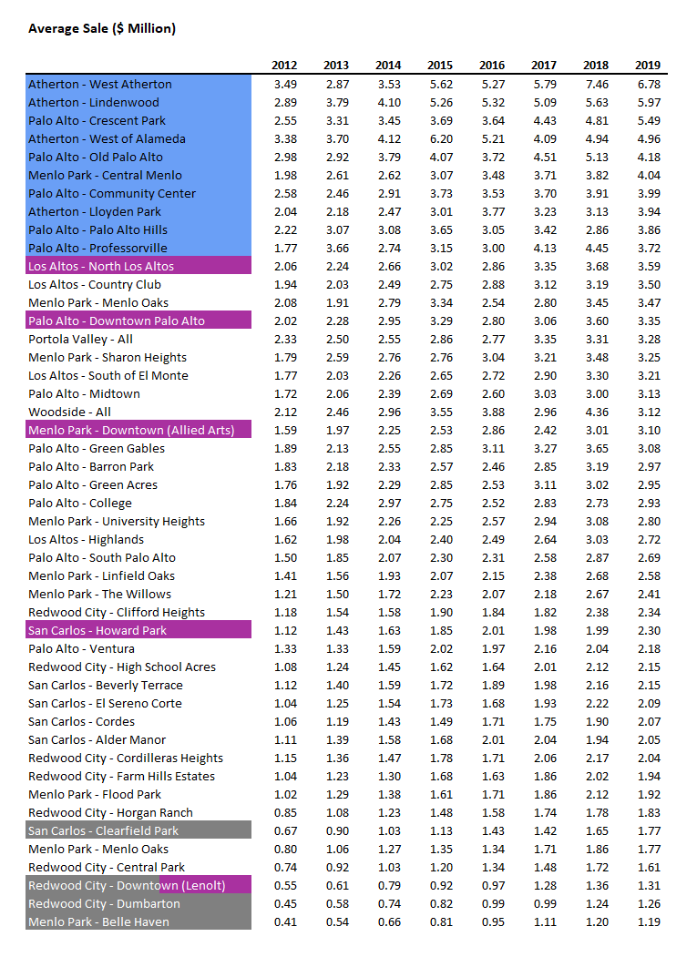
Obviously, the Blue Bloods define the top – that’s how we decided to categorize them. We see most of Atherton, four areas of Palo Alto (Old Palo Alto, traditionally viewed as “the best”, is actually ranked a bit lower due to an abnormally strong rise in Crescent Park concurrent with a sharp dip in Old Palo Alto… which shows how this analysis is sensitive to the specific time-frame selected…), with Central Menlo also joining the party. The downtowns are spread out through the lower two thirds of the chart. The 101 Corridor almost defines the bottom of the chart.
OK, Enough Preamble! Where Should I Put My Money?
We’re almost there! But first please note that your home-buying decision should not be guided by this sort of analysis alone. Not everyone wants or values the same things. One buyer wants to get out of the hills and into a stroller-friendly sidewalked area. Another is eager to reduce a grinding commute but will not compromise on their back yard. Another wants to downsize but stay in the same neighborhood because of the friendships. Another wants privacy and good schools over everything else. At the Young Platinum Group, we pride ourselves on listening to you, and even testing your hypotheses, before we start writing offers on some analytical “best”. So this sort of “big data” approach is but one aspect of a holistic approach to your new home, not the ultimate and only answer.
My Personality Type is Spock. I Have Money to Drop and You Promised Me Answers.
OK, we’re finally ready. If we look at each neighborhood’s average sales price, and index them so that 2012 is 0%, we can see how each neighborhood has appreciated. This equalizes for the fact that with $6 million you can buy one house in Crescent Park but five in Dumbarton. And here, finally, are the results, ranked in order of appreciation between 2012-2019:
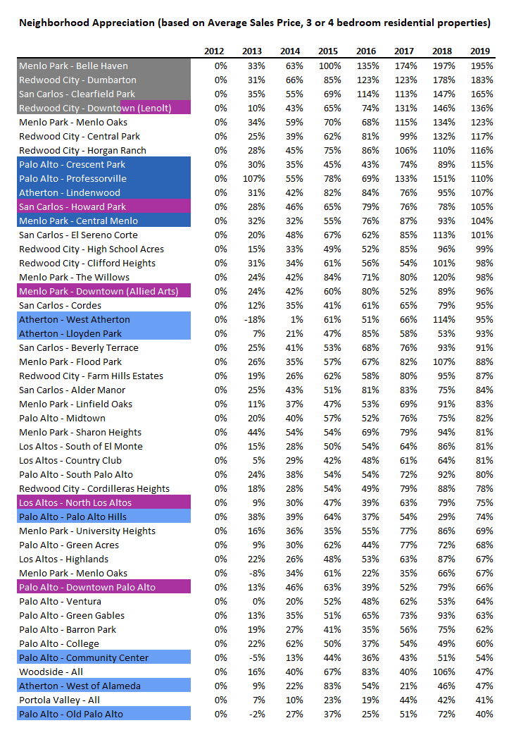
…and if we group them by Area Type:

Wow! A dollar invested in Belle Haven in 2012 is now worth 195% more: almost tripling in seven years! Your Portola Valley investment did not pay out as well however—its is worthy only 41% more than what you put in. So, which Area Type performed the best?
Gold Medal: the 101 Corridor
Wow! The 101 Corridor has been a fantastic investment; the five neighborhoods averaged 170% appreciation! This is partly a heartwarming tale of how development is recycling our most marginal places and increasing the value to people. In the case of Belle Haven, it is a story of Facebook Village. One can also note that the increasing value of proximity to the 101 is perhaps symptomatic of the value of a shorter commute, or the continued primacy of the car over “healthier” ways of commuting. A cynic might say that the marginal homes are being bid up to stratospheric levels because our phenomenal job creation engine is drawing in newcomers who cannot afford anything else. The optimist looks at the creative destruction that is repurposing land to higher and better uses. But one thing is certain: these up-and-comers have been *the* place to stick your investment money.
Silver Medal: Blue Bloods (near Downtowns)
We were so struck by the disparity between the Blue Bloods that we decided to split them into two chunks: the top 4 performers, and the laggards. What did the top 4 have in common? They are generally within walking distance to a great downtown. One can debate this on the margins… Community Center is fairly walkable to downtown Palo Alto but it did not see as much appreciation as Lindenwood, which is further from downtown Menlo Park. But it is certainly the case that the furthest out “high end neighborhoods” lagged in terms of appreciation versus the closer-in ones. These are really nice houses with an average price of $4.8 million in 2019, but they also saw an excellent 109% appreciation between 2012-2017. People who can buy here are getting the best of both worlds: proximity to restaurants and shopping, while also posting strong financial gains.
Bronze Medal: Downtowns
Our five best downtowns have gone up 95% over the past 7 years, which is still quite strong. When we started this analysis, it seemed anecdotally obvious to us that people were increasingly preferring an urban life to a secluded estate. We assumed the Downtowns would outperform every other neighborhood, and wanted to verify if our assumptions were correct. And we were surprised to see another group actually outperforming them. Redwood City and San Carlos live up to their reputations as the “hot places” by performing the best, while downtown Palo Alto had a mediocre performance (partly due to a drop in 2019 average sales price). Maybe downtown Palo Alto is just in a more “final” state than the others.
The Others
The area of the Peninsula where we at the Young Platinum Group work saw a general appreciation of 90%, which is a baseline of sorts. (For comparison, the S&P 500 index went from 1312 in January 2017 to 3230 in December 2019, an appreciation of 146%. This is a bit of a false comparison however; home purchases are relatively safe to leverage via a mortgage, while long stock purchases are intrinsically much riskier).
The Blue Bloods that had a more suburban character posted an appreciation of +67%. With an average sales price of $4.62 million, these are undoubtedly lovely areas. In some cases, their relative lack of appreciation reflects their high status; these are *not* up-and-coming neighborhoods; this is where people have gone when they have “made it”.
Participation Prize
The mountainous countryside did not fare well in the appreciation race. Portola Valley at 41%, Woodside at 47%... these are better than a loss, but not nearly as nice at their neighbors closer to the jobs. These are lovely areas, frequently with large properties and grand estates. It seems, however, that buyers are increasingly opting for a neighbor they bump into over the privacy that these prestigious rural areas offer. It should also be noted that these areas are notoriously difficult to build in, which forces a lot of creative destruction to more hospitable jurisdictions (we’re looking at you, Atherton, with your developer-friendly awesomeness).
Critiques of Our Methodology
When one does a survey of a broad topic like this, one inevitably makes compromises for convenience and to suit the nature of the data. When we work with you specifically, we can conform the analysis to your needs. Let us be the first to note areas for improvement:
We settled on 3-4 bedrooms everywhere. This may mis-state the high end areas, where 5-6 bedrooms are more the norm. We could have cooked up a clever hybrid where we are comparing 3 bedrooms in San Carlos with 6 bedrooms in Woodside, but we didn’t.
We are only using on-market data. We’ve proven (in unpublished work) that in Atherton, where a high fraction of sales are off-market, on-market sales are in fact representative of all sales. But depending on your needs this may or may not be valid to assume.
We could have used median in places where we used average
Certain measures could be volume-weighted instead of using a straight average
We are drawing conclusions from small data sets. One might critique and say out cutoff points are too small (we allow just 5 sales in Lindenwood in 2019 to define it’s excellent performance)
Some areas are too big. Allied Arts is really different in feel from Downtown Menlo Park, but they are lumped together. North Los Alto is much more than a downtown. More sophisticated Area definitions can reveal more nuance.
Such criticisms are valid. Data analysis is an art as much as a science. Nonetheless we believe that broad and valid trends do emerge from the choices we have made.
Conclusion

The strongest pure investment opportunities (+170% appreciation) were in the “101 Corridor” between Menlo Park to San Carlos. Opportunities here are modestly priced, with an average price of $1.4 million.
Of our ten most expensive neighborhoods, those that were easily walkable to a downtown appreciated +109%, at an average sales price of $4.8 million. These areas offed the best blend of strong appreciation and high quality.
Downtown cores were strong performers also (+95% appreciation, $2.73 million average sales price). People increasingly like to walk to restaurants and live in vibrant, denser neighborhoods.